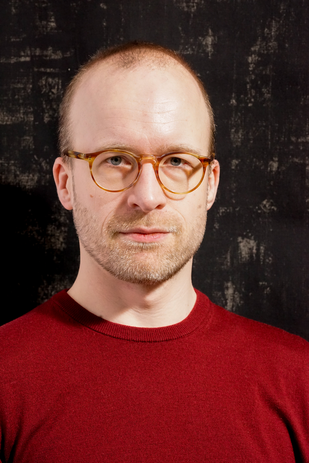
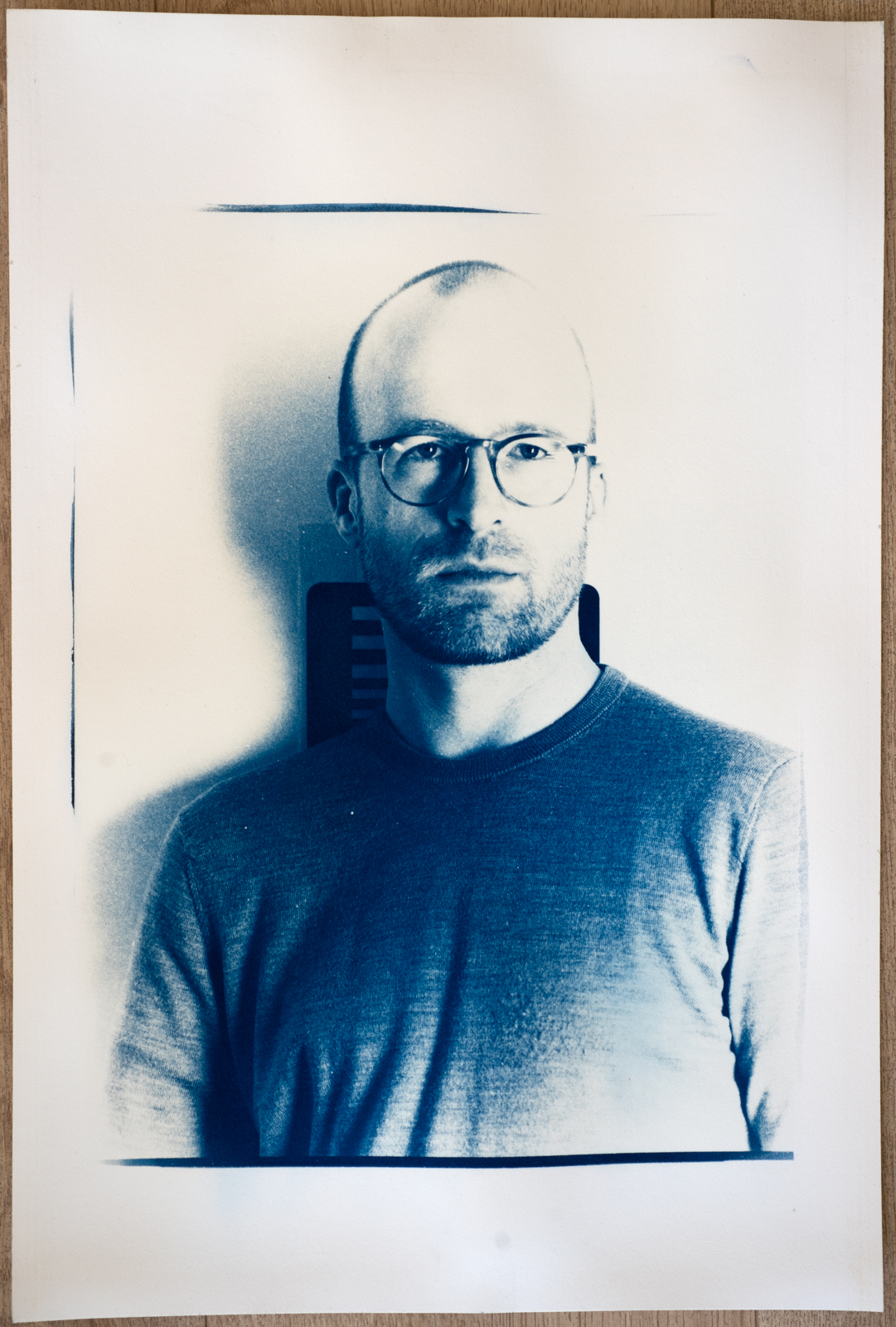
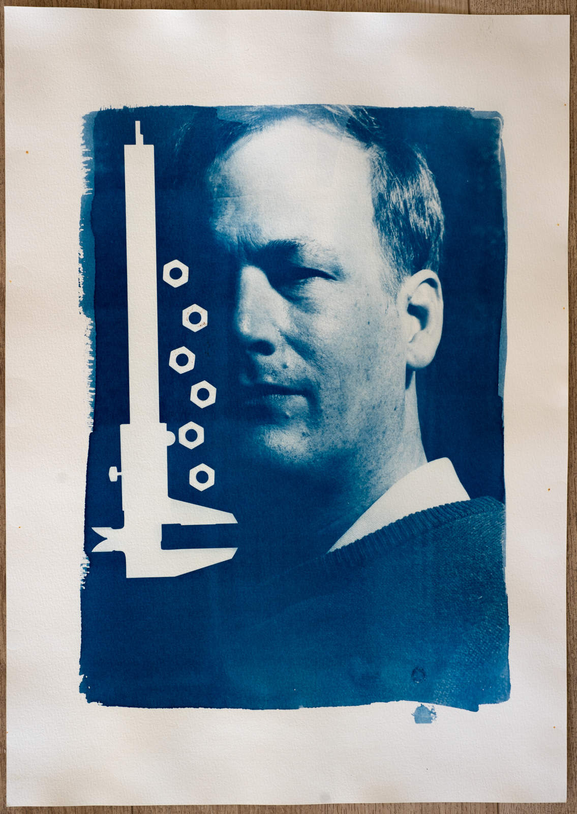
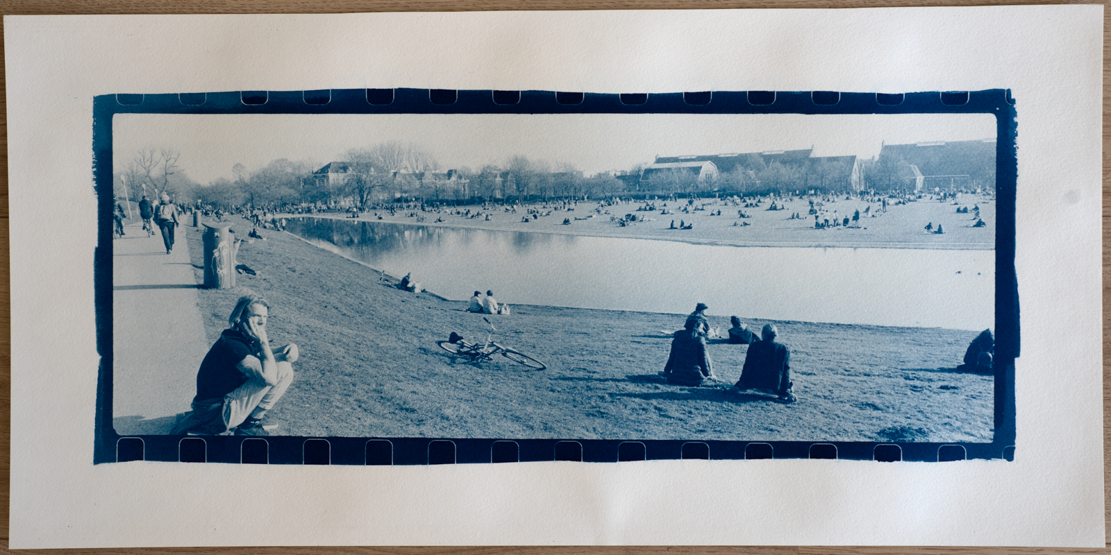
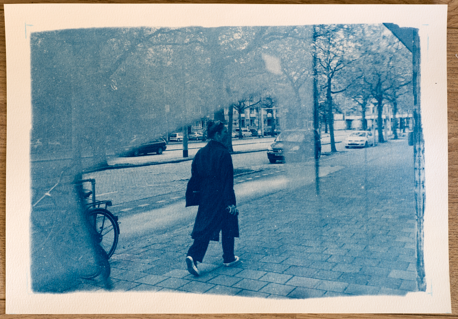
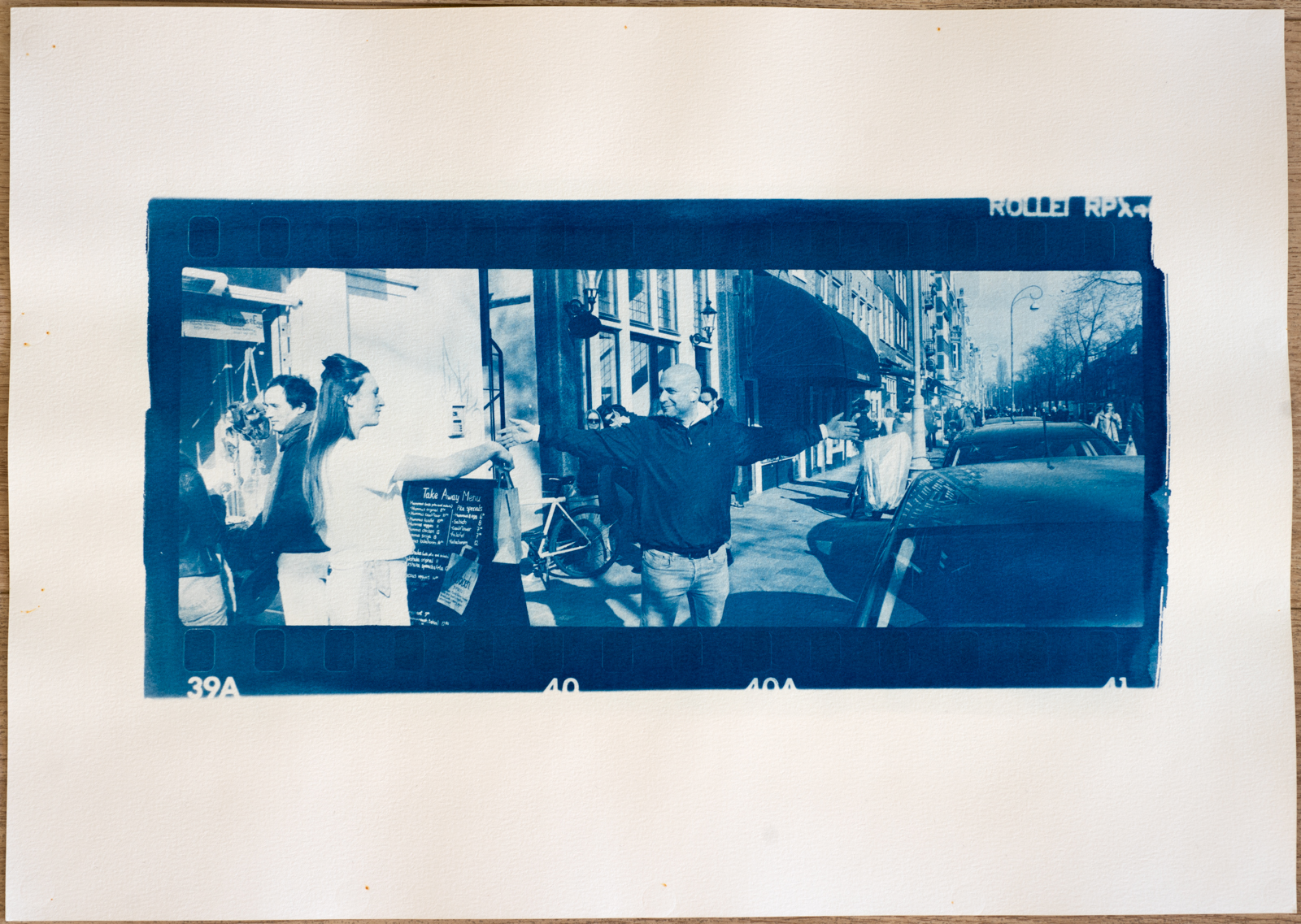
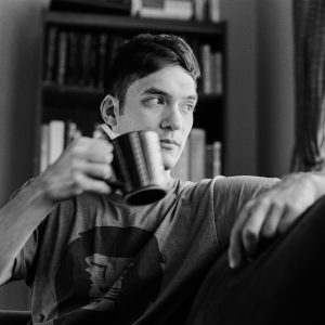
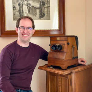
Douwe Krooshof is a portrait and street photographer from Amsterdam, who works in black and white film and cyanotype techniques. He takes inspiration from mid-century classic photography and takes an interest in the technical side if analog photography.
How can you explain your choice of genres and techniques?
As a photographer I have never truly enjoyed digital photography in the same way as analog photography. I like the process of creation, and I enjoy mastering as many elements of the process as possible. This is why I shoot black and white film, and why I develop and print myself. In this way the images I create are truly my own.
Photography is also a reduction of reality, and in the reduction lies the expression of the photographer. Digital imagery is so ubiquitous these days that it’s hard for any single image to stand out. What does it take for people to realise that an image in front of them tells a story? Somehow analog photography does a better job at this.
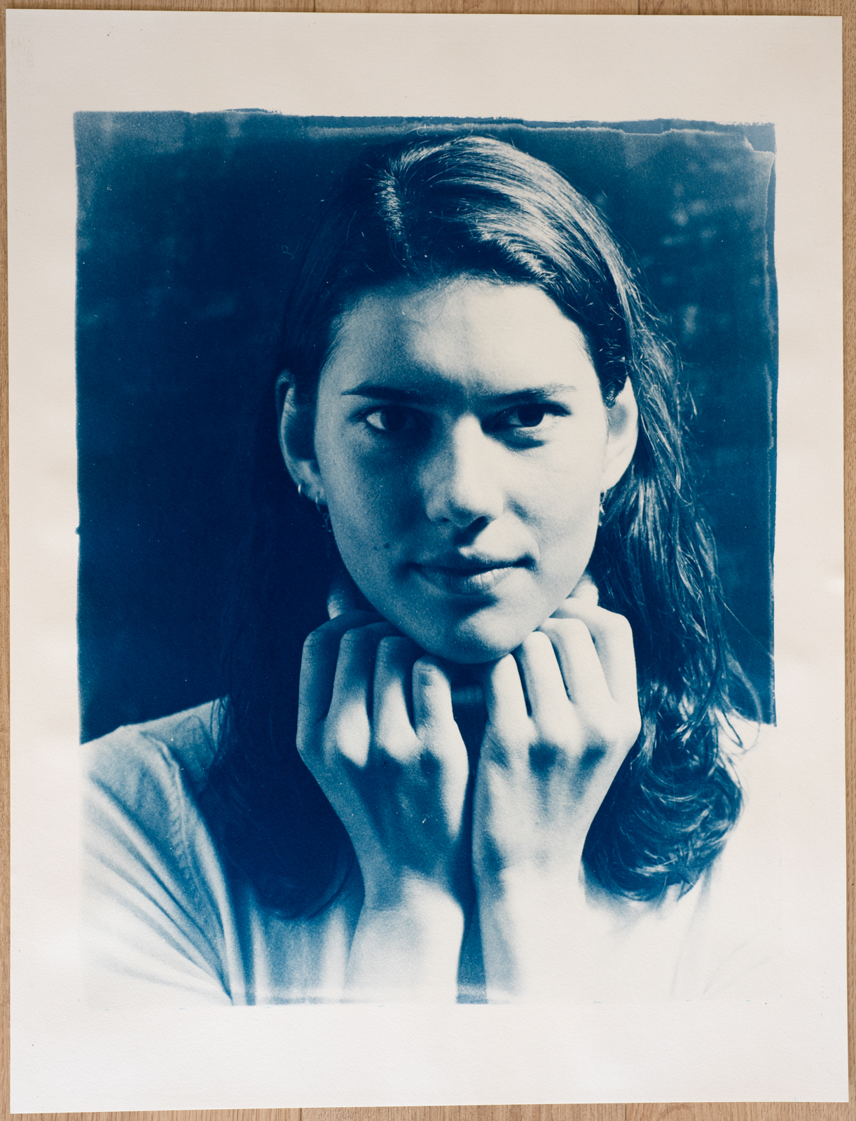
So why cyanotype? I had seen a documentary on historic photographic processes and I was intrigued by the cyanotype process. I immediately liked the strong blue images. The idea of coating my own paper and making very large prints really appealed to me. At the same time I did not want to work with contact prints of digital negatives. I wanted to print portraits from medium format negatives!
Over the first months of the year, through a lot of experimentation, I made a special photographic enlarger to enlarge my negatives onto cyanotype paper. I believe I’m one of the first persons to do this. It has been the start of an exploration of the cyanotype that is still ongoing. I’m printing most work in cyanotype these days, and the contrast of the Prussian blue images still captivates me.
As I see some of your cyanotypes are collages. What do you prefer: to print images in cyanotype or to create collages?
The photographic image is the primary medium to me, how I express that image is an artistic choice made differently every time. The collages are a layer of expression added to the primary image. The cyanotype enlarger has given me many options to experiment with new ideas. Most of the collage elements in my prints you could replicate in black and white prints, but I associate it more with cyanotype. This is perhaps tied to the history of the process and the work of Anna Atkins who first started using the technique to document plants.
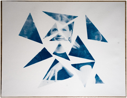
Could you, please, tell more about ‘Gestalt – Fragments of Eva”?
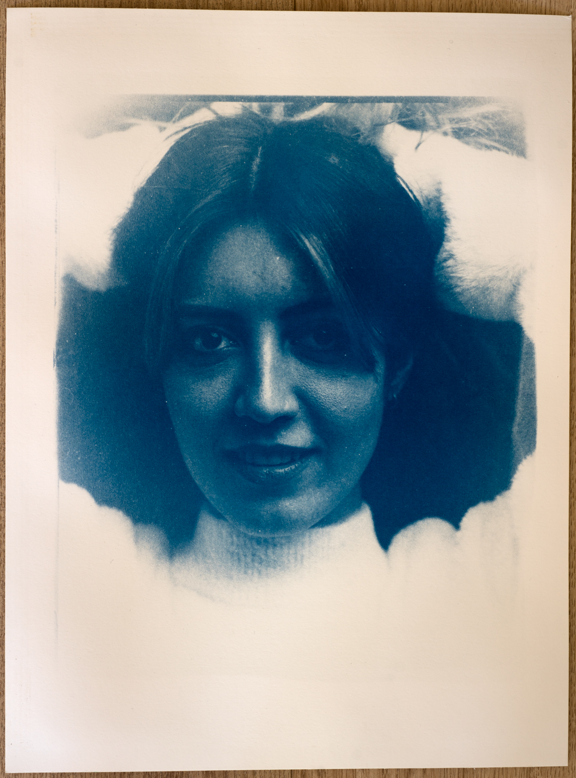
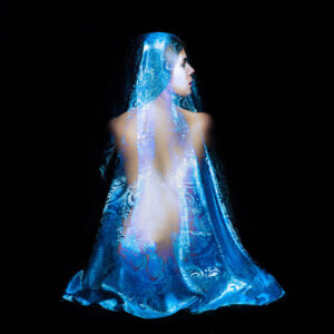
This print is the result of the question: What is the essence of a portrait? Most people who did a psychology course in college remember that the German word ‘Gestalt’ (shape) is used in psychology to indicate that the brain can infer a whole picture when only a few parts of a picture are given. This was the idea for this portrait. Could I only add a few elements of the negative and still convey the expression, the body language, and the essence of the model?
The idea came to me when I was making test strips. Some of the test strips seemed to capture key elements of a picture. I would subconsciously allow these bits of paper to lie around the enlarger, I didn’t want to throw them away. After a while I realised that I could leave out most of the negative: only a few parts of the image carry the expression. Gestalt would do the rest.
I made the image by sketching a pattern of triangles on top of an initial print of the image. This pattern was turned into a full size stencil that I used to selectively coat the paper with cyanotype emulsion. The paper was positioned under the enlarger so that the pattern of triangles and the projected image lined up.
Which of your collages is your favourite?
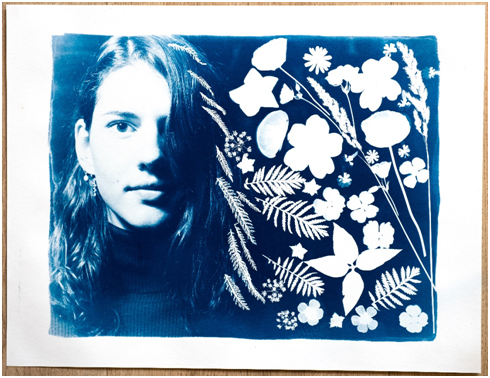
My favourite collage is the ‘Wild Flower’ flower print. It is dear to me because it is the first successful combination of an enlarged photograph and a photogram in a single print. It is a reference to the work of Anna Atkins. I had the idea for this print for the longest time, but there was a lot of work involved in creating it. To see this come to fruition was very satisfying. Just to mention a few steps in the process: I created the negative with this final image in mind, so I planned the negative space and the lighting to have a suitable background for the collage. I collected flowers in the park and tested which types transmitted more and less UV light. To get the size of the flowers and the portrait right I had to scale up the size of the print, this involved rebuilding the enlarger to accommodate for this. Finally I had to make the collage on the sensitised paper without seeing the image of the portrait. It was a challenging process, and it taught me a low about photography.
What is really important in photography for you?
This is of course very personal, but for me an image should carry itself without a narrative. A good image is an image you want to look at without an explanation of its relevance. It should convince with esthetic quality or it should evoke empathy. As of late I get the sense that musea exhibit a lot of work that is ideological or political in nature, where series of photographs convey a view or an opinion. This is no doubt an important function of photography, but it leaves me wanting. I enjoy photography that convinces me though a raw esthetic, images that don’t use narrative as a crutch to lean on. This is what I strive for.
Could you tell us about your favorite tricks?
Write down your ideas immediately when you have them. I don’t have the time to realise all my ideas, but writing them down keeps me inspired. I also find that it helps me to build on earlier ideas and over time this helps me to develop artistic concepts. Also, I try to talk about my concepts with other photographers to get their reactions and suggestions. I find that I really value the opinions of people who also express themselves visually.
On the technical side I encourage people to experiment. Don’t let yourself be held back by a need for perfection. Improvements and mastery will follow over time when you allow yourself to start experimenting. I keep telling myself this!
I think, there are some photographers who inspire you. Can you tell us about these people?
I’m inspired by classic photographers in street photography, portraiture, and fashion. Examples are Henri Cartier-Bresson, Robert Frank, Diane Arbus for the environmental work, for capturing moments of public life that later became icons and standard images to represent the era in which they were taken. I’m also inspired by Richard Avedon, Helmut Newton and Peter Lindbergh for portraiture. I admire portraits that give the viewer the sense of a strong connection with the model (Avedon) but also the powerful representations of women in fashion by Newton and Lindbergh.
Do you participate in any exhibitions or contests?
Prior to the cyanotype project I never felt the need to exhibit. My work has always been a personal pursuit of esthetic, and hasn’t had a major theme or purpose behind it, be that an artistic or a societal one. The cyanotype project has changed this. In the process of developing the enlarger and the technique I’ve done a few technical talks. The audience responded very positively to the example work I showed on these occasions. This has given me the confidence that I have work worth sharing, so I’m exploring ways to start exhibiting.
An additional driver to start exhibiting is the difference in experience between viewing a large print in real life, and viewing an online presentation. The size, texture, and presentation adds to the experience in a way that is impossible to convey online.
Do you earn money via photography or it is just a hobby?
Thankfully I don’t depend on photography for my income, so I can be very independent in my photographic pursuits. That being said I make prints on request, so your readers may get in touch for that (via DM).
